Bringing AI To Interview Scheduling
Designing an AI-native interview scheduler that automates coordination without taking control away from recruiters.
0→1 · B2B SaaS · AI · Recruitment
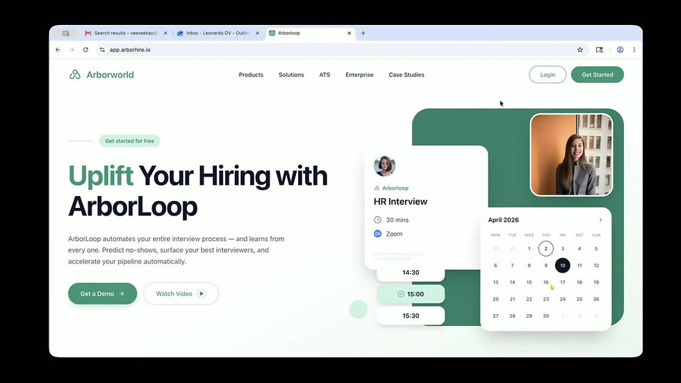
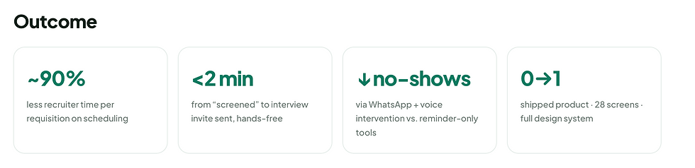
Worked in tight, testable loops across product, design and engineering — using research, competitive teardown, paper prototyping, iterative redesign, usability testing and handoff to design and validate the experience.

About the project
Arborloop is an AI native interview scheduling platform. It automates the whole process, from finding open slots and assigning panels to sending invites over email and WhatsApp, preventing missed interviews, and running multiple rounds, so recruiters focus on candidates, not calendars. Candidates get a branded portal to pick a time, see who they're meeting, and prepare.
Arborloop lives inside Trove, the HR suite from parent company Arborworld.
Challenge
Automate the entire interview workflow in a way experienced recruiters actually trust visible and overridable, never a black box while delighting candidates.
And do it as a 0→1 product, designed by one person, going up against mature, well-funded incumbents.
Problem Statement
Interview scheduling is hiring's most manual chore. Recruiters lose hours per role to calendar tetris, time-zone math, reschedules and no-shows, time stolen from evaluating candidates, while candidates go silent between rounds with no visibility or way to prepare.
Business Goal
Use automation and AI to help hiring teams:
-
Schedule and re-book interviews with zero manual coordination
-
Prevent no-shows before they happen, not just remind
-
Give candidates a transparent, prep-ready experience
-
Stay compliant with India’s DPDP Act on every plan
Project Kick-off
Before starting, I focused on understanding the problem space and aligning with the team on clear goals. I aimed to uncover
-
The stakeholders’ expectations from making interview scheduling Arborworld’s first wedge into the HR market.
-
Why scheduling, rather than another HR module was the right place to start.
-
The core problems for all three users: recruiters, interviewers and candidates.
-
Why this would be valuable enough for teams to switch from incumbents or manual work.
-
How success would be measured once the product shipped.
Measuring Success
Before designing, the team aligned on what success actually meant. We measured it across three levels of engagement.
Adoption — Did a team schedule at least one interview through Arborloop instead of doing calendar tetris by hand?
Activation — Did they run a full loop hands-free — auto-schedule → reminders → feedback → next round — without falling back to manual work?
Deep Usage — Did Arborloop become the default? No more spreadsheets or calendar juggling, every requisition runs through it.
We focused specifically on activation, because a recruiter who completed one full hands-free loop was far more likely to keep using it and abandon manual scheduling entirely. One scheduled interview wasn’t enough to change behaviour, completing the full loop was.
Design Process
I followed a structured design process: starting with empathising, then defining user personas, moving into ideation and paper-to-high-fidelity prototyping, and finally testing to validate the experience.

1. Empathising with the users
Qualitative Research
To build a scheduler that recruiters would trust, I interviewed recruiters and tried to understood their current process for scheduling interviews, from start to finish.
-
Method: I tried to understood how recruiters schedule interviews today. They check each interviewer's calendar one by one, email the candidate back and forth to find a time that works, send the invites themselves, and then chase people whenever something needs to be rescheduled, often tracking it all in emails or in a spreadsheet. Seeing this helped me spot the real problems and understand what they hoped automation could take off their plate.
-
Audience: 2 recruiters & TA leads from a company called Spiro, who was interested in trying our product once we had a first draft ready.


These insights directly shaped Arborloop’s automation model, its communication channels, the no-show system, and the candidate portal — balancing automation with visible human control.
Competitive Analysis
I studied 15+ scheduling products, led by two direct competitors: ModernLoop and GoodTime. I mapped their strengths honestly, then looked for the gaps Arborloop could own. The exercise directly shaped Arborloop’s feature set.


2. Defining The Goals
User Personas
Insights clustered around three primary users with very different sometimes opposing needs. Designing for all three without overwhelming any became the central tension of the product.

Problem Statement
When a candidate is screened, getting them in front of the right panel is slow and manual. It means cross-checking calendars, time zones and interviewer load, sending invites, chasing confirmations, and re-doing it all on every reschedule. Recruiters spend more time coordinating logistics than evaluating people — and candidates feel the neglect.

3. Ideate & Structure
Card Sorting & Information Architecture
Before designing the dashboard's Information Architecture, I conducted a card sorting exercise with users to understand how they naturally perceive information and under which categories they expect to find it. This study helped align our navigation with the users' mental models, ensuring an intuitive layout that places key insights exactly where they look for them.


I conducted an online card sorting exercise in FigJam where I created pre-defined categories and feature cards, closely observing user behavior and mental models as they sorted the items.
User Flows
Once I had the clarity of the IA, I designed user flows to ensure a seamless and logical progression through the dashboard before moving to low-fidelity wireframes.


Iterating based on usability test results
Now and later

For the most part, the usability tests on Arborloop went very smoothly. However, a few key areas surfaced where small but meaningful changes could significantly improve the recruiter experience. These included simplifying tab navigation on the Scheduled Interviews page, giving recruiters more control over round level invite sending, and making the Quick Schedule flow the default path since that is what users naturally reached for first. I sorted the improvements based on their impact on core recruiter workflows and the effort required to ship them. Some ideas have been set aside for future iterations due to engineering complexity or the need for further stakeholder alignment.
Priority revisions


Building the visual identity from scratch.
4. Visual Design
I designed Arborloop's logo and visual language from the ground up. The mark is deliberately minimal, a single continuous form that quietly suggests a loop, so it stays clean at any size while still hinting at what the product does. I built the interface around a calm palette led by teal that feels trustworthy and easy on the eyes across long recruiting days, using generous spacing, soft surfaces and restrained accents so the automation stays in focus rather than the chrome. I then carried that identity consistently across every screen, from typography and buttons to status colours and Arlo's presence, giving the whole product one coherent, confident personality.

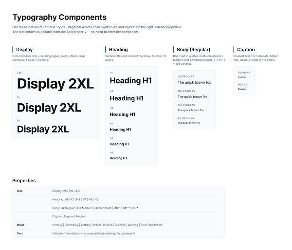
Build Design System in Figma
I built the design system alongside the visual design. A few core components existed before I started, but I kept refining and adding to the system as the work progressed, so it grew in step with the product.

.png)


Deliver
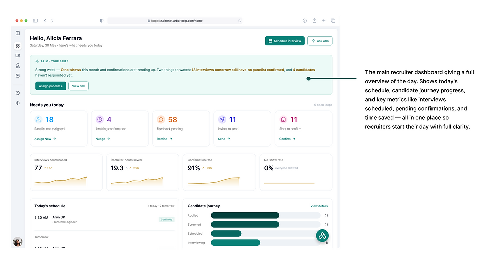
How does Arborloop address recruiter needs?
The Problem: Recruiters managing multiple open roles struggle to coordinate interviews efficiently across candidates, panelists, and hiring managers. Manual scheduling creates bottlenecks, leads to no-shows, and makes it difficult to track where each candidate stands in the process.
The Solution: A platform that gives recruiters full control over the interview lifecycle through smart auto-scheduling, a candidate journey tracker, round level invite management, panel assignment, and real-time analytics so every interview gets coordinated with less effort and more visibility.


Arborloop started as a bet: that a solo-designed 0→1 product could earn the trust of recruiters who'd been let down by scheduling tools before. That bet paid off in the most meaningful way a design can it won a customer.
The MVP converted Spiro, our first design partner, from an interested team into an active client. Their recruiters are now using Arborloop in earnest, running real requisitions, real panels and real candidates through it. That depth of use matters more than any sign-up count, because it's precisely the activation signal the whole product was designed to earn a team choosing to run their actual hiring through it rather than falling back to spreadsheets.
What makes this a beginning rather than an ending is the loop it set in motion. Spiro's recruiters send a continuous stream of feedback from live hiring, and we fold it straight back into the product sharpening the auto-scheduling, tightening Arlo's proposals, and hardening the flows that carry the most weight. Every cycle makes Arborloop measurably more reliable and more trusted, and moves it closer to becoming a team's default rather than an experiment. Designing for trust, it turns out, isn't a one-time act it's the thing this feedback loop keeps compounding.
Key Takeaways
-
AI earns its place by assisting, not replacing : Recruiters are experts at reading people; that's not the part to automate. Arlo's value came from removing the coordination labour so recruiters could spend their judgement where it counts designing it as a supportive assistant beat designing a black box that decides for them.
-
In enterprise AI, trust is an interface not a feature : People let go of a manual process only when they can see what the machine is about to do and undo it. Showing Arlo's reasoning and confidence, and keeping a human in the loop, did more for adoption than any amount of accuracy claimed on a landing page.
-
Designing for opposing users means separating, not compromising : The instinct to serve recruiter, interviewer and candidate through one shared UI would have shortchanged all three. Splitting into distinct surfaces on a shared system let each user get exactly what they needed without diluting the others.
-
Optimising for one honest metric focuses everything : Choosing activation over adoption gave every decision a tie-breaker. When a feature didn't help someone reach their first complete hands-free loop, it waited. Constraint, not more features, is what made a solo 0→1 product feel coherent.