Oracle HCM Cloud (Enterprise HR Platform)
Redesigning HR workflows for mobile-first efficiency in global organizations

About the project
The project focused on redesigning Oracle HCM Cloud, a comprehensive HR management platform used by global companies to manage hiring, promotions, payroll, leave, learning, and other employee-related processes. The platform was primarily desktop-based, and many workflows were complex, making it difficult for users like recruiters, managers, and employees to complete tasks efficiently, especially on mobile devices.
The business goals of the project were:
-
Make the platform mobile-first and responsive, allowing users to perform HR tasks easily on phones and tablets.
-
Simplify complex HR workflows, such as hiring, promotions, and salary adjustments, to improve speed and efficiency.
-
Build a consistent design system with reusable components and UX patterns to ensure usability across different modules.
-
Improve user experience for all types of users, from recruiters to managers to employees, ensuring tasks can be completed intuitively.
-
Strengthen Oracle’s market leadership by delivering a modern, efficient, and user-friendly HCM solution that stands out against competitors like Workday and SAP.
Team
Role: UX & Visual Designer
Team: 6 (Including me, 2 Junior Designer's, 1 Project Manager, 10 Engineers)
Duration: Nov 2023 - June 2024
Problem Statement
The existing Oracle HCM system was mainly designed for desktop use and was not optimized for mobile devices. This made it difficult for users to complete tasks on smaller screens. Also, many HR processes were complex and time-consuming, which reduced efficiency and affected user experience. There was a need to simplify these workflows and make them more intuitive so users could complete tasks quickly without confusion.
Roles & Responsibilities
-
Led end to end UX UI design process
-
Conducted user interviews and usability testing
-
Created wireframes and high fidelity designs
-
Built reusable components for the design system
-
Ensured designs followed accessibility standards
-
Collaborated with developers to ensure feasibility and smooth implementation
Metrics & Revenue Growth
-
After the mobile-first redesign was launched, the project had a strong business impact. The improved user experience helped users complete tasks much faster, reducing the average task time from around 5 minutes to less than 2 minutes.
-
The product also saw significant business growth. It generated around 75 million dollars in revenue, with a 22.5 percent growth rate, and gained over 1000 new users.
-
Most importantly, Oracle’s position in the market improved significantly, moving from behind competitors to becoming the number one leader in the HCM product market.

Design Process
I followed a structured design process: starting with empathizing then defining user personas, moving into ideation with HMW technique, creating user flows and prototypes, and finally testing to validate the experience.

1. Empathising with the users
Qualitative Research
To understand the needs of users and the challenges they faced, we conducted in-depth user research at the start of the project. Our goal was to uncover pain points across HR workflows and guide the mobile-first redesign.
-
Method: We primarily conducted user interviews and contextual inquiries with recruiters, hiring managers, and line managers. Each session lasted around 60 minutes via Zoom.
We focused on understanding
-
How users manage hiring, promotions, and employee data from start to finish.
-
The pain points in tracking candidates, approvals, and employee interactions.
-
The success metrics they use to evaluate hiring and HR processes.
-
Their expectations and frustrations with the existing desktop-centric Oracle HCM system.

.png)
-
Audience: 25 participants across different HR roles, including factory hiring managers, campus recruiters, professional recruiters, executive recruiters, and high-volume retail recruiters.
We focused on understanding
-
Which tasks are repetitive or take the most time?
-
How do you currently manage approvals and employee data?
-
What frustrates you about the current desktop workflows?
-
What would make mobile HR tasks easier and faster?
Outcomes:
-
Users preferred guided workflows that reduce confusion and manual effort.
-
They wanted clear visibility into candidate and employee information.
-
Mobile access needed to prioritize key tasks without overwhelming the user.
-
Insights shaped the design of Compact Guided Process (CGP) patterns, editable forms, and mobile-first flows.
Competitive Analysis
We also analyzed competitors’ HR platforms to understand industry trends and identify best practices for mobile experiences:
.png)
Workday Native mobile applications are still being invested in as they produce a better experience. Its visual design gives the appearance of responsive design. Native solutions are used to give optimal user experiences.
.png)
Salesforce uses responsive design techniques to provide device-optimized layouts, a stacked single column layout for phones, and a side-by-side, two-column layout for tablets.
.png)
SAP Fiori is a collection of apps with a simple and easy to use experience for broadly and frequently used SAP software functions that work seamlessly across devices and platforms.
.png)
Key Takeaways
-
Mobile-first experiences were a growing expectation in the industry.
-
Clear, responsive workflows improve usability for managers and recruiters.
-
Design systems and reusable components help maintain consistency across complex HR platforms.
This research and analysis informed our design decisions, ensuring that Oracle HCM’s mobile redesign would meet user needs, reduce friction, and align with industry best practices.
2. Defining The Goals
Problem Statement
After conducting user research, I identified the core problem: Complex, desktop-centric workflows and limited mobile access were slowing productivity, creating errors, and negatively affecting the overall user experience.
1. For Recruiters and HR Teams
Users were spending excessive time on repetitive tasks such as entering candidate information, managing multiple approvals, and tracking employee data. This reduced productivity, increased the likelihood of errors, and prevented them from focusing on higher-priority HR activities.
2. For Managers and Employees
Managers and employees needed to complete approvals, promotions, and profile updates on the go, but the existing system was primarily desktop-based and not mobile-friendly. This caused delays, frustration, and inefficiencies in critical HR workflows.
User Persona
Based on our user research, 5 personas were created to help guide design process and solve design challenges.
-
Factory Hiring Manager
-
Campus Hiring Recruiter
-
Professional Hiring Recruiter
-
Executive Hiring Recruiter
-
High Volume Retail Hiring Recruiter


3. Ideating Ideas
How Might We?
After defining the problem statement, we ran a “How Might We” brainstorming session with the product manager and tech team to generate multiple solution ideas, focusing on quantity while ensuring feasibility within the timeline and technical constraints.
-
HMW simplify repetitive HR tasks for recruiters and managers?
-
HMW make approvals, promotions, and updates easy on mobile?
-
HMW reduce errors and guide users through workflows?
-
HMW create a consistent design system across devices?
-
HMW improve visibility and tracking of tasks?
User Journey


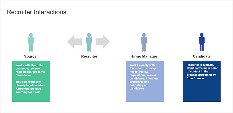
Interaction Models between Sourcer, Recruiter, Hiring Manager, Candidate types were also analyzed as below. Then we concluded different tasks in each phase and state for each interaction model.

Enlarged Detail of Recruiter Interactions
.png)
User Goal
Goals
We refined the user goals in each phase and state during the entire recruiting cycle.


4. Design Exploration & Iterations
MVP Flow
We started from MVP - Add Contact Information flow. It was chosen as the MVP flow as it’s the most common flow in HCM products and it has the basic edit & read-only mode. Below is my original proposal.


Iteration - 1 - Container Added
Components were created at this stage. Container helps to organize the content in a certain area. In the HCM applications, it usually requires a large amount of content.
.png)

Iteration - 2 - CGP Pattern Created
CGP (Compact Guided Process) was the first UX pattern created to guide user through all the steps until all steps are complete.
26 UX patterns were created in total. My contribution includes participating the creation of 7 patterns: CGP, Attachment, Form Layout, Inline List Edit, Faceted Search, Landing Page, Toolbar. See the CGP flow chat below.

CGP aims to resolve the current desktop train stop design issue. Train Stop design is not easy to be transformed into mobile responsive design because of the horizontal constrain.
Example of a 6-Train-Stop (it’s common that Train-Stop can take 5 - 7 stops, in Recruiting Create Requisition, it takes 12 stops)

CGP resolved this issue by placing the stops vertically instead of horizontally. By clicking “Continue“, the section(stop) closed automatically. User will be guided to the next section. When the task flow is completed, Call to Action button “Save“ or “Submit“ will be enabled so user can finish the task.


Iteration - 3 - Edit Mode Exploration
Edit Mode and Read-only Mode are most common patterns for hiring managers/recruiters/employees to manage the content. Due to the real estate concern, we explored different versions (1 and 2 and 3 columns) of edit/read-only mode. The first version is one column center aligned component for Edit Mode.
.jpeg)
.jpeg)
Iteration - 4 - Adopted Version
Below are the two MVP flows adopted design for the Mobile First project. The first one is section edit for adding Contact Information. The second one is CGP for Promote. Compact, simple, engaging, highly usable, versatile, commonly used in many flows.


.png)
Usability Testing
When the design was solidified, we tested increasingly more clickable high fidelity prototypes with customers through online user testing platforms. We had Customer Feedback Sessions asked users to go through the promote flow prototype. User reactions were documented at each stage of the testing.
Objective
-
Gather usability feedback and overall impressions of the MSS Change Salary and Reassign Direct Reports actions
-
Assess the ease of use and discoverability of key features
-
Incorporate feedback into the designs and improve the user interface (UI)
Requirements
-
Line Managers. Have at least 1 direct report
-
Has been in their current position for at least 6 months
-
Must be familiar with salary adjustment and reassigning direct reports
Session Format
-
1-on-1 feedback sessions conducted in person with 10 participants
-
Each session was 1 hour long
-
Participants were given 4 tasks to perform on a prototype
High-level Findings
What worked well
-
8/10 Participants liked the UI and felt that it was easy to use
-
6/9 Liked being able to select multiple individuals in one flow
-
6/9 Liked “batching” the process (i.e., being able to send reports to different managers in the same screen)
-
8/9 Liked how search worked. Specifically, being able to bring up information from multiple fields (e.g., both name and manager’s name
Areas that need improvement
-
3/10 Felt that QA screen space was not allocated correctly
-
9/10 Wanted more specific reasons for salary change
-
5/10 Expected to see background information to support change salary
.png)
-
(7/9) Expected to be able to select or drill down to indirect reports in Person Selector
-
(9/9) Did not understand “Manager Type”
-
(6/9) Were confused why “Add Directs” followed “Reassign Direct Reports”
.jpeg)
Detailed Findings by Task


Usage Metrics Testing
Central UX Research team tested Usage Metrics at Evaluate stage. Test results revealed 80% users completed the Promote journey in less than 2 minutes, while the previous version before Mobile UX took about in average 5 minutes. It showed the accuracy and completeness with which users achieve their goals were substantially increased.

Customer Feedback Platform
Customers can directly submit their feedback to Customer Connect platform. It’s the place for sharing customers’ ideas, voting and discussing any existing issues about features and designs.

Designing Recruiting Flows
My role for creating & building design system and UI components and UX patterns was successfully fulfilled. I returned back to my team and led 23 flows for Recruiting product. We started with competitors Research, conducting user testing through the discovery process, iterating draft wire-frames.
Sketching Wire-Frames

Based on a design system we built with basic patterns and components, while we iterated the designs, we were continuously developing the design system. I worked together with other 28 designers, we delivered more than 60 products in less than 3 months. Below are the first 8 flows I completed for Recruiting.
ICE (Internal Candidate Experience) Landing Page

Job Search Result Page - Card View
.png)
ICE Flow Chat - 5 Flows: 1. Search/View Jobs, 2. Apply a Job, 3. View/Accept Offer, 4. Refer a Colleague, 5. Job Search Activity

Candidate Pool Flow Chat

Challenges Faced
-
One of the main challenges in this project was simplifying complex HR workflows for mobile. Tasks like hiring, promotions, and payroll involve multiple steps and a lot of data. The challenge was making these processes intuitive on smaller screens without losing any functionality. We solved this by introducing guided workflows and vertical step-by-step flows, so users could complete tasks easily without getting overwhelmed.
-
Another challenge was designing for diverse user roles. Recruiters, managers, and employees all have different goals and ways of interacting with the system. We addressed this by creating flexible patterns and reusable components that could adapt to each user’s needs while keeping the experience consistent.
-
Building user trust and confidence in the system was also critical. HR processes are sensitive, so users needed to clearly understand what actions they were taking and their impact. We solved this by making workflows transparent, showing clear progress indicators, validation messages, and context for every step.
-
Finally, we had to balance usability with technical constraints. Some features depended on the existing backend, which limited how far we could redesign interactions. We worked closely with developers to iterate on practical solutions that met both user needs and technical feasibility.
Outcome
-
Reduced task completion time from ~5 minutes to under 2 minutes
-
Improved overall user experience and workflow efficiency
-
Increased user adoption, especially on mobile devices
-
Generated ~75 million dollars in revenue
-
Achieved 22.5 percent growth rate
-
Onboarded 1000 plus new users
-
Helped Oracle become the number one leader in the HCM market