
- 1Enable quick, secure international payments
- 2Reduce manual effort and errors
- 3Support mobile approvals for executives
- 4Increase digital banking adoption
- 5Reduce customer support calls
Case study 03 · Deloitte Corporate banking · B2B
Simplifying foreign currency transfers for corporate clients
Designed and automated the end-to-end workflow for initiating and approving international fund transfers for a renowned Mauritian bank.
Product Design Digital Transformation Design Systems Mobile
Confidential information has been omitted to adhere to my Non-Disclosure Agreement.
About the project
The bank aimed to simplify foreign currency transfers by automating manual initiation and approval processes, reducing errors and improving efficiency for corporate clients.
Outcome
89%Transactions automated, reducing manual effort
+20%New internet banking users within a year
AnytimeFaster approvals through mobile access, anywhere
Payment initiators faced repetitive tasks, and approvers struggled to authorise on the go, causing delays and inefficiencies in corporate payments.
- Led end-to-end design in a small UX/UI team
- Created wireframes and high-fidelity mockups
- Built and maintained the design system
- Developed interactive prototypes
- Conducted design quality assurance
- Coordinated with developers for accurate implementation
Project kick-off
Before starting, I focused on understanding the problem space and aligning with the team on the goals, gathering the right context so the solutions would address real user pain points. I focused on understanding:
- The stakeholders’ expectations from redesigning the corporate payment system
- The reason behind improving the current payment initiation and approval workflows
- The core problems faced by corporate users, including initiators and approvers
- Why these improvements would be valuable to users and the bank’s business
- How success would be measured at the end of the project
To answer these, I reviewed existing workflows and approval processes and customer feedback tickets from corporate clients. This helped me map the current user journeys, identify pain points, and understand the vision for the new corporate banking platform.
See a few fun (and slightly silly) questions I asked our PM during the kickoff 😄Setting KPIs & success metrics
Based on historical data, benchmarks, and expected improvements after the redesign, the PM defined these success metrics for the team:
85%Transaction automation · payments processed without bank staff intervention
−40%Operational efficiency · fewer initiation errors via validation and autofill
−50%Approval efficiency · faster approvals with mobile and bulk approvals
+25%Digital adoption · more corporate digital transactions
These targets gave us a clear benchmark to measure success and guided design decisions throughout the project.
Design process
A structured process: empathising and affinity mapping, defining user personas, ideating with card sorting, creating user flows and prototypes, and finally testing to validate the experience.
- EmpathiseInterviews & shadowing
- DefineAffinity map & personas
- IdeateCard sorting
- PrototypeFlows & screens
- TestValidate with users
Empathising with the users
Qualitative research
The goal: understand corporate users’ needs, challenges, and workflows before defining solutions.
Remote Zoom sessions with 5–7 users (finance executives, accountants, CFOs, directors) across Mauritius to capture diverse perspectives.
Monitored users interacting with the current system to identify workflow delays and usability issues.
Reviewed transaction logs, error reports, and usage analytics to uncover patterns in transactions, errors, and workflow times.
Questions asked
- How do you initiate payments today?
- Which steps feel repetitive or time-consuming?
- What challenges do you face when entering beneficiary details or amounts?
- How do you track the payment status after submission?
- How do you currently review and approve payments?
- Do system limitations cause delays in approvals?
- How often do you need to approve payments while travelling?
- What would make the approval process faster and easier?
Outcomes
- Initiate a payment to a new and existing beneficiary
- Repeat a saved/favourite transaction
- Keep a check on the account summary
- Check the transaction status dashboard
- Check notifications
Defining the goals
Affinity mapping
I clustered user insights to spot common pain points, which helped me define a clear problem statement, user stories and priorities before designing.
Problem statement
Research revealed the bank’s corporate clients had slow, manual international payment workflows. The solution aimed to streamline the process for both initiators and approvers.
Manual entries reduce productivity & increase errors
Analytics showed initiators spend 22% of their time on repetitive tasks like finding frequent transactions, entering a saved beneficiary’s name and the amount. This hurts productivity, increases human errors and keeps them from high-priority work.
Legacy software lacked modern integrations
Approvers needed to authorise payments on the go, but the existing platform was obsolete, non-responsive, and couldn’t support modern integrations. This caused delays and customer dissatisfaction, and impacted the bank’s credibility.
User personas
From the patterns I discovered, I created personas for both roles to understand their goals, needs, and pain points before designing solutions.
Opens a PDF in a new tab
Ideating ideas
Card sorting & user flow
I ran a card sorting exercise with users to learn how they naturally group content and which terminology makes the most sense to them. Using those insights, I created user flows mapping the steps to complete key tasks, so navigation and interactions matched users’ expectations.
User flows
I redesigned the experience from the moment the initiator selects “Foreign Currency Transfer”, through to the approver’s decision.

Track A · Payment initiator · WebDesigning a new “Make an international payment” landing pageFor Smith, the accountant who initiates transfers every day.
A faster way to start a transfer
The new landing page needed to give customers quick access to three main functions, with a conversational tone of voice in the labels:
- Initiate a payment to an existing beneficiary
- Initiate a payment to a new beneficiary
- Repeat a saved/favourite transaction
Why didn’t they work?
Repeated labels like Beneficiary Name, ID and Bank name confused customers, as there was no visual hierarchy in the content.
The design did not have a primary call to action.
In testing, “Pay a new beneficiary” was the most used feature, and it didn’t stand out in this design.
Four scenarios, solved
Scenario 1
Initiate a transfer to an existing or new beneficiary
Problem
“I have to search for previously saved beneficiaries and transactions every time I log in. It’s quite redundant and consumes a lot of my time.” · Smith
Solution
A new landing page with quick access to the most used functions, like paying an existing beneficiary and repeating a saved transaction.
Scenario 2
Entering details of the beneficiary
Problem
“I expect the system to save the beneficiary’s details and show them when I repeat a transaction to the same beneficiary next time.” · Smith
Solution
Beneficiary details are autofilled when initiating a transfer to an existing beneficiary.
Scenario 3
Authenticating the transfer with a soft token
Problem
“I often forget to carry my hard token device with me, and then it gets difficult to authenticate the transfer.”
Solution
A new “Soft Token” feature that removes the need to carry the hard token device around.
Scenario 4
After the transfer is initiated
Problem
“I don’t have visibility on the status of the approvals for my transactions.”
Solution
Every request gets a reference number for easy tracking, and initiators are notified each time an approver takes action.

Track B · Payment approver · MobileHow might we enable approvers to authorise payments on the go?For Christina, the CFO who is constantly travelling.
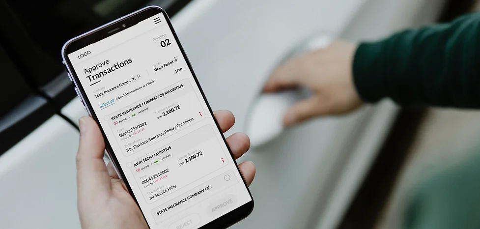
Designing the approvals mobile app
The main goal of the app was to give detailed information about the payments to be approved. Secondary goals were to let approvers:
- Keep a check on the account summary
- Check the transaction status dashboard
- Check notifications
Approvals, on desktop and mobile
Scenario 1
Approving or rejecting transactions
Problem
“I am constantly travelling and it gets difficult to access my laptop every time.”
Solution
A new mobile application to approve or reject transactions on the go.
Scenario 2
Bulk approving or rejecting
Problem
“There are more than 50 transactions a day to look at. It’s very time-consuming to act on each one separately.”
Solution
The ability to bulk-select transactions and approve or reject them together.
Scenario 3
Transaction dashboard
Problem
“I don’t have visibility on the status of the transactions once they are approved.”
Solution
A transaction dashboard showing whether every transaction is in process, successful or unsuccessful.
Scenario 4
Checking account balances
Problem
“I am unable to keep a check on the money going out.”
Solution
An Account Position view with a detailed look at the balance of each of the company’s accounts.
When things go wrong
We designed for moments when customers hit a roadblock, like the system being down or a session expiring, so they always have a clear way out instead of frustration.
Challenges & how I overcame them
Corporate approvals involve large amounts, compliance checks and many data points: beneficiary details, currency, amount and approval status. Translating this information-heavy desktop workflow to a small mobile screen was a major design challenge.
Issues faced
- Critical financial information was hard to display clearly on mobile
- Senior executives needed to review and approve quickly while travelling
- It had to stay secure and compliant, while being simple and fast
- The legacy system wasn’t responsive, which limited some approaches
How I addressed it
- Prioritised key transaction information for quick review
- Card-based layouts and progressive disclosure to show more only when needed
- Simplified the approval flow to reduce steps and cognitive load
- Worked closely with developers to keep designs technically feasible
As a B2B banking product, direct access to end users was restricted by privacy and compliance rules. I combined analytics data, support tickets and feedback from product managers and sales teams, ran remote Zoom interviews with a small group of corporate users, and observed product demos and sales calls to understand real workflows.
The platform ran on legacy infrastructure that limited modern UI capabilities and integrations. I worked closely with developers and PMs to understand technical constraints early, iterating designs frequently so they stayed feasible while still improving usability and efficiency.
Outcome
- 89%of transactions were automated, significantly reducing manual processing and improving operational efficiency.
- +20%new Internet Banking customers within one year, showing stronger adoption of the bank’s digital channels after the mobile app launch.
- Fasterapproval cycles through mobile approvals, letting corporate users review and approve payments anytime, anywhere.
- Bulkapprovals and autofill improved workflow efficiency, cutting repetitive tasks for users managing many transactions.
- Fewermanual errors thanks to improved form validation, structured inputs, and simplified payment workflows.
Key takeaways
- Collaboration and communication are key.
- Constraints are an opportunity. Technical limitations restricted design explorations, but taught me to design well within them.
- Empathy for the team. Working cross-functionally means understanding your teammates, not just your users.
- Advocate for the user, while also understanding the business and tech needs.
What’s next?